Last week, I deleted the Windows 8.1 bootcamp partition off my MacBook. Not so long ago, I was running Windows 7 are my primary OS on my old MacBook Pro. Then I upgraded to a retina machine and installed Windows 8. The horrible desktop experience and inability to handle a mix of high and low DPI screens meant I soon abandoned Windows to work almost exclusively in OS X. Later, I installed Windows 8.1, which was supposed to address these problems, but the improvements were marginal. The DPI problems remained the most egregious. OS X handles moving applications between the primary, retina screen and attached, low-DPI monitors almost seamlessly. In Windows 8.1 it is a nightmare of mismatched font sizes, tiny and minuscule UI elements, and ugly pixelation. I really cannot understand why Apple can do this so well and Microsoft cannot.
This week I installed the technical preview of Windows 10 in Parallels and gave it a try. Tech journalists seems to be impressed with it, lauding it as the Windows 7 to Windows 8’s Vista, but my impression was somewhat different. There are improvements to the desktop experience, mostly achieved by regressing some of 8’s most aggressive touch-favouring UI changes, but the DPI problems remain, and the overall feeling is still of an OS with a split personality, or perhaps multiple personalities. This manifests most strongly in the look and feel, which is an ugly, inconsistent mess, straining under the legacy of Microsoft’s various design shifts over the years, and their inability to comprehensively unify the UI of all the sprawling parts of their OS.
The first install screen seen in Windows 10 demonstrates this problem perfectly:
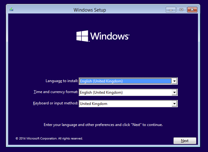
In this one screen, we are presented with the Modern UI colours and logo, Windows 7 style window chrome, and Windows 95 style drop-downs.
Now, this screen may just be an artefact of the technical preview, hopefully the final install experience will be a lot slicker, but such clashes in look and feel are present throughout the OS. Over the years, Microsoft have reinvented the look and feel of Windows several times, but without ever dragging all of the OS into each new style. The result is a patchwork of UI styles from various eras, inevitably regressing to the ugly rectangles and grey hues of Windows 9* as you delve into the more obscure applications, utilities and options screens.
The introduction of Metro/Modern UI in Windows 8 was by far the biggest shift in look and feel Microsoft have ever made in Windows. Opinion may vary over how usable and aesthetically pleasing it is, but what is certain is that mixing it haphazardly with the old-school appearance does neither any favours, yet this mix is primary motif of contemporary Windows. The result is discordant, and this discordancy makes the whole OS unpleasant to look at and to use. Windows 10’s concession to allow Modern UI apps to run in the desktop is welcome, but they still look strikingly wrong sitting alongside traditional applications on big, low-DPI screens, and do not feel optimised for mouse and keyboard interaction. Just being able to run applications like Windows’ “People” or “Weather” in a desktop window can’t disguise that their UI is designed for small, high-DPI touch-screens. On a desktop PC, their massive UI elements and copious horizontal scrolling makes them unpleasant to use, but Windows 10 as yet shows no intention by Microsoft to adapt these applications properly for bigger screens.
Despite the acclaim they receive for their design chops, Apple are far from perfect at UI work. Many things in OS X are unintuitive and hard to fathom. For example, I am still regularly baffled using Finder to navigate around my hard disk. But Apple do get the basics right. Their OS look and feel evolves gradually, and even when some parts lag behind others, they always feel like they belong to the same piece of software. The same cannot be said for the modern Windows experience, which instead gives you visual whiplash.
Microsoft should do one of two things: First, admit defeat on unifying desktop and mobile Windows and re-bifurcate them, getting rid of the Modern UI apps on desktop Windows and replacing them with a new set using a unified, traditional desktop style look and field. Second, go all in on Modern UI, get every part of the operating system using it, with no exceptions, and deal properly with the need to adapt to different screen sizes and DPIs. This means taking a leaf out of the Responsive Web Design book and creating interfaces that make the best use of the screen real estate and input devices available on the host machine. Although it is only a preview, Windows 10 does not look to be going down either route, and is instead continues being an uncomfortable halfway house between the old world and the new.
Leave a Reply