I’ve decided to post about problems with the user interfaces of some applications I use. Mostly as a way of exploring UI design and practicing talking about it and doing it, but also to get the annoyances off my chest, and in the hope that people who work on these applications might read my comments, agree with them, and implement changes accordingly.
I’m starting with the open source vector graphics package Inkscape. In particular, its Fill and Stroke panel, which has long grated on me a little whenever I use it. When you criticise an open source application, you are of course laying yourself open to the classic response of ‘patches welcome’. In the case of Inkscape, it’s a complex mass of C++ and Python code, neither of which I speak, which makes it difficult for me to contribute. That’s not to say I won’t have a go at some point, but for now I’m just going to present my thoughts via these posts.
The Fill and Stroke panel is, as its name suggests, used to control the fill and stroke properties of a shape. In vector graphics, a shape can be defined as a sequence of nodes that form a path enclosing some area. The fill of a shape is how the area enclosed by the path is painted. The stroke is how the path itself is painted. A fill might be painted with a solid colour, a gradient between different colours, a pattern, or something more exotic like a procedural image generator. Since the fill and stroke of its component shapes are obviously of critical importance to how a vector image looks, it follows that the UI for manipulating them is also of high importance within an authoring tool.
By default, when Inkscape launches the panel is hidden, and the interface looks something like this:
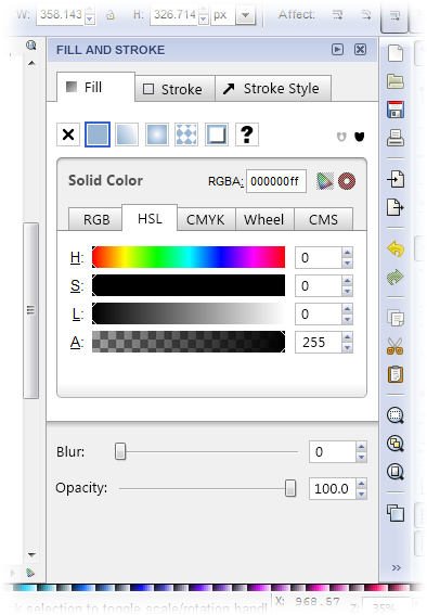
To display the fill and stroke panel, you right click on a shape and select ‘Fill and Stroke…’ from the context menu, and voilà…
Note that I’m using a much smaller Inkscape window than normal for these images to keep the size down. Normally the panel doesn’t take up so much of the real-estate, although it still takes up a fair bit, even on a 26″ monitor like mine. In terms of pixels width, what you see is the minimum space it can occupy when visible.
Ignoring usability and focusing only on aesthetics, the panel is pretty ugly. It sits badly with the UI around it and just seems a bit sloppy and confusing. The following image highlights the problems I noticed:
If I was fixing the aesthetic problems, while leaving the layout and usability broadly the same, I would change the panel to look something like this:
It’s not perfect, but I think it clears up quite a few of the problems, while reducing the width required slightly, and making better use of what space there is.
Of course, while aesthetics help to make using an interface a little more pleasant, the actual layout and usability of the panel are far more important when authoring. Also, this image only represents the panel in a single state. Selecting different tabs and paint modes causes different controls to appear, and their design needs to be considered as well. In particular the design of Inkscape’s (and other packages’) gradient editor is a bugbear of mine. In future posts I intend to investigate ideas for improving the layout an usability, and also address the design of the panel when in different modes.


Leave a Reply